@TOC
一 、群体药代动力学数据探索目的和方法
数据探索目的
建模前通过图法和统计学方法,对研究数据探索可揭示数据特征,发现明显趋势,辨识离群值,异常值等。
数据来源
数据来自于焦正主编的基础群体药动学和药效学书籍第10章第二节模型数据
方法
作图主要用ggplot2包,及代码中涉及的包。
作图所用主题为ggplot2默认主题:theme_bw() 稍调整
二、数据探索过程
PK数据探索
加载的包和设目录
代码:
#加载的包----
library(ggplot2)
library(dplyr)
library(scales)

#设置目录----
x<-readline() #读取以下目录字段
D:\study\NONMEN\JIAOZHENG\第10章第二节代码示例199\第10章第二节代码示例\chapter10-section2\datacheck
x <- gsub("\\\\", "/", x) # 将反斜杠转换为斜
setwd(x)  #设置目录
读取数据和数据处理
代码:
#数据读取和处理----
DATA<-read.csv("10-2.csv",header=T,skip=0) #读取数据:数据为焦正主编的基础群体药动学和药效学书籍第10章第二节模型数据
DATA$GROUP<-paste(DATA$DOSE,"mg")   #组别加上单位
DATA$DOSE_f<-factor(DATA$GROUP,levels=c("2 mg","3 mg","4 mg","5 mg"))   #组别转化分类因子

PKDATA<-filter(DATA,MDV==0,DVID==1)  #提取PK数据
PDDATA<-filter(DATA,MDV==0,DVID==2)  #提取PD数据
PK数据结果(部分):

PD数据结果(部分):
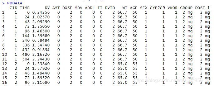
平均血药浓度计算和作图
计算血药浓度均值代码:
#计算血药浓度均值和标准差----
ConcvsTIMEALL<-summarise(group_by(PKDATA,TIME,DOSE_f), #按照分类计算
                         mean=mean(DV),   #计算均值
                         sd=sd(DV),       #计算标准差
                         n=sum(!is.na(DV)),
                         se=sd/sqrt(n))   #计算标准误差
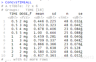
计算结果:
平均血药浓度图(每个剂量组情况)
代码:
#作平均血药浓度图(按照组别分组)----
CONCPprofile<-
  ggplot()+
  geom_point(data=ConcvsTIMEALL,aes(x=TIME,y=mean,color=factor(DOSE_f)))+   #数据-点
  geom_line(data=ConcvsTIMEALL,aes(x=TIME,y=mean,color=factor(DOSE_f),group=DOSE_f),size=0.7)+ #数据-线
  labs(color="",shape="")+
  xlab("Time(day)")+ylab("Concentration (ng/mL)")+   #坐标轴标题
  # xlim(0,216)+  #x轴限定
  # ylim(0,20)+   #y轴限定
  scale_x_continuous(breaks=c(c(0,48,96,144,192,240,288,336,384,432,480,528)),
                     labels=c("0","2","4","6","8","10","12","14","16","18","20","22"))+ #坐标轴刻度设置
  facet_wrap(~DOSE_f,ncol=2)+   #分两列
  theme_bw()+  #内置主题
  theme(axis.text=element_text(size=10,color='red'), #坐标轴字体设置
        axis.title = element_text(color='black',face = "bold"),#坐标轴标题设置
        panel.grid.major =element_blank(), panel.grid.minor = element_blank(),#网格线设置
        legend.position = "right") #图例设置
CONCPprofile
ggsave("ALLbygroupprofile.jpeg", CONCPprofile, width = 6, height = 4)

CONCPprofile<-
  ggplot()+
  geom_point(data=ConcvsTIMEALL,aes(x=TIME,y=mean,color=factor(DOSE_f)))+
  geom_line(data=ConcvsTIMEALL,aes(x=TIME,y=mean,color=factor(DOSE_f),group=DOSE_f),size=0.7)+
  labs(color="",shape="")+
  xlab("Time(day)")+ylab("Concentration (ng/mL)")+
  # xlim(0,216)+
  # ylim(0,20)+
  # scale_shape_manual(values = c(4:10))+
  scale_x_continuous(breaks=c(c(0,48,96,144,192,240,288,336,384,432,480,528)),
                     labels=c("0","2","4","6","8","10","12","14","16","18","20","22"))+
  facet_wrap(~DOSE_f,ncol=2)+
  scale_y_log10()+
  theme_bw()+  #内置主题
  theme(axis.text=element_text(size=10,color='red'), #坐标轴字体设置
        axis.title = element_text(color='black',face = "bold"),#坐标轴标题设置
        panel.grid.major =element_blank(), panel.grid.minor = element_blank(),#网格线设置
        legend.position = "right") #图例设置
CONCPprofile
ggsave("ALLbygroupprofilelog.jpeg", CONCPprofile, width = 6, height = 4)
作图结果
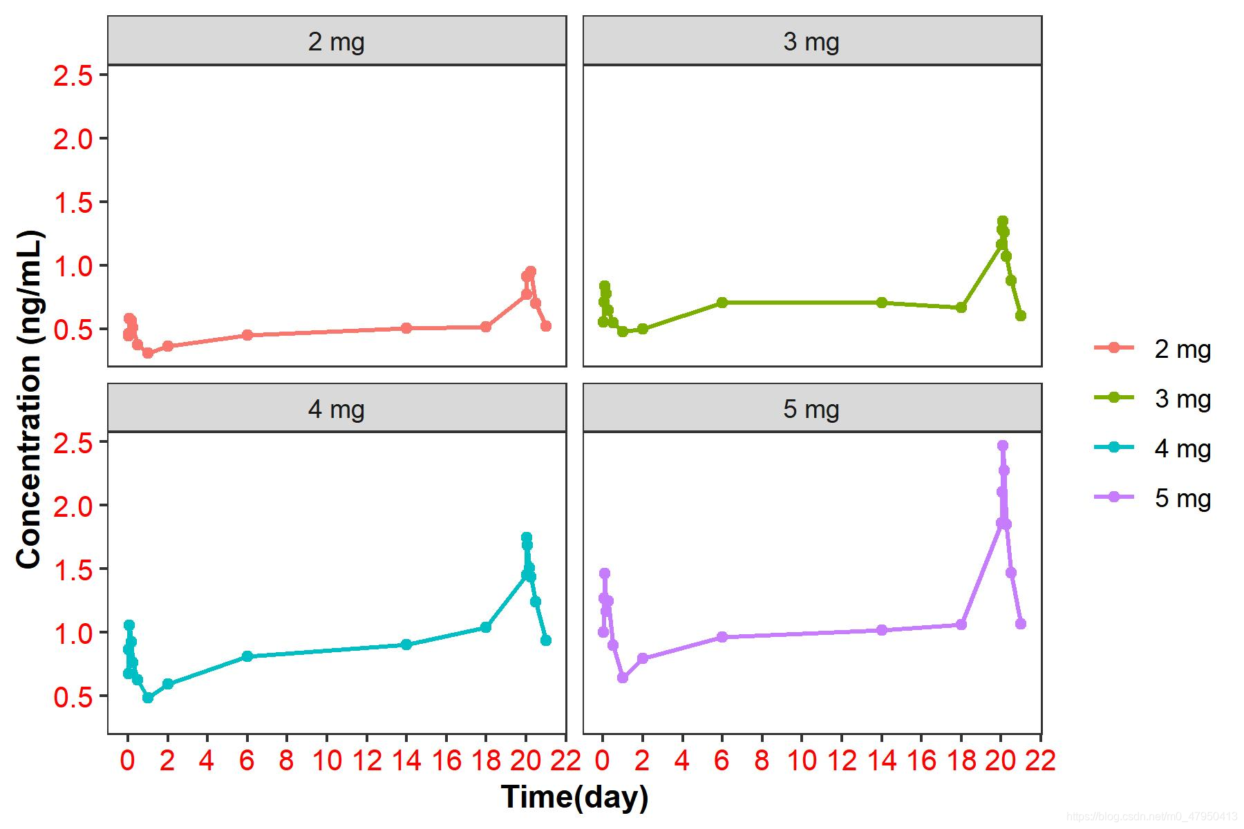
正常坐标:
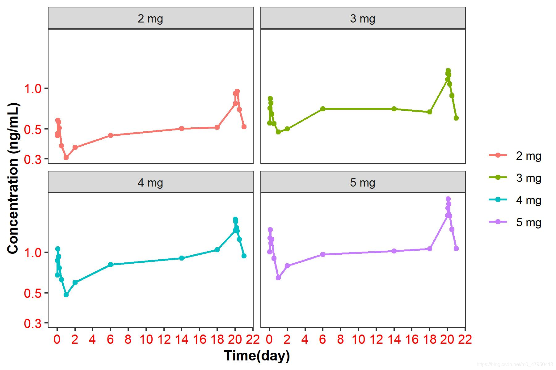
对数坐标:
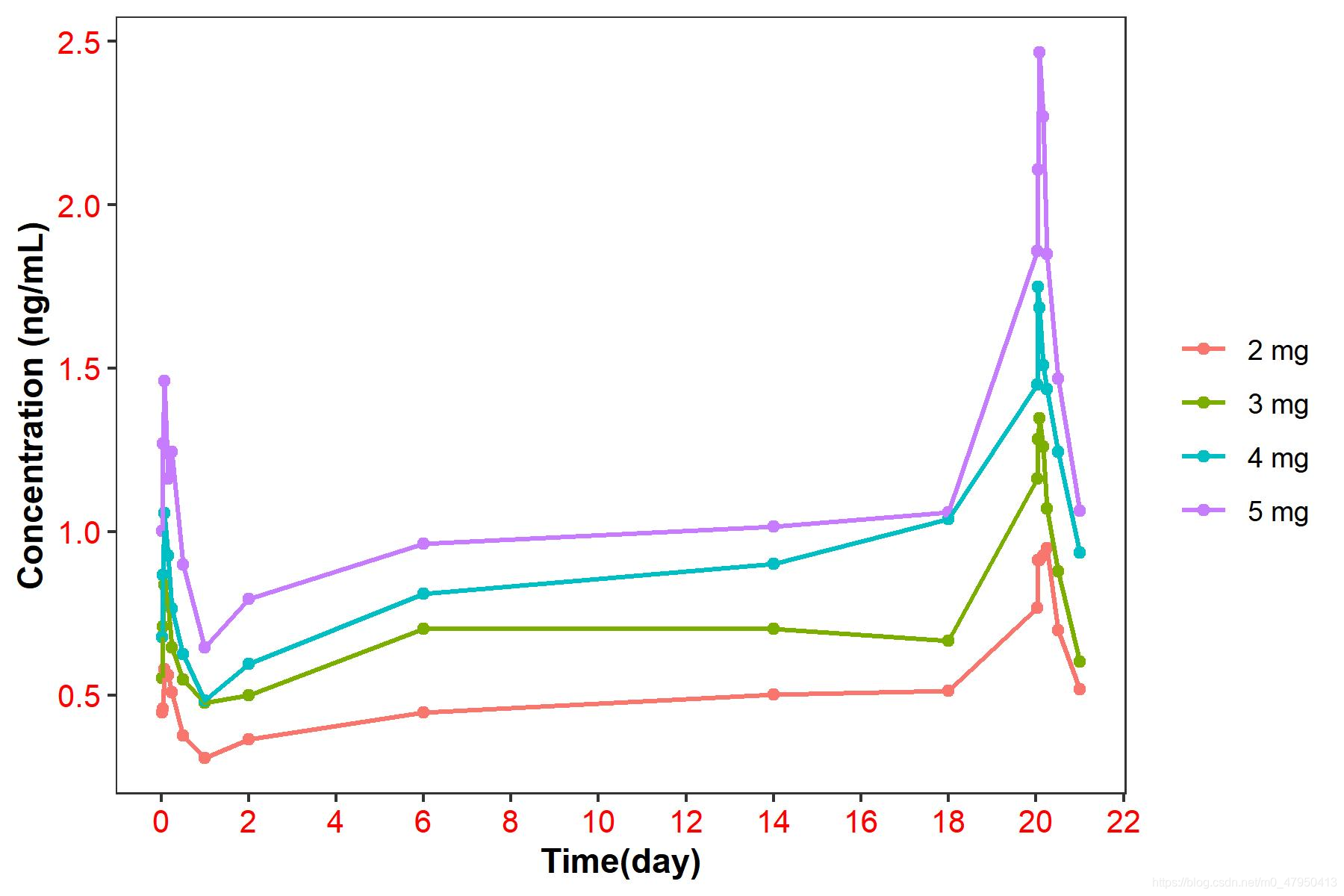
作平均血药浓度图(总体情况)
代码:
#作平均血药浓度图(总体)----
CONCPprofile<-
  ggplot()+
  geom_point(data=ConcvsTIMEALL,aes(x=TIME,y=mean,color=factor(DOSE_f)))+
  geom_line(data=ConcvsTIMEALL,aes(x=TIME,y=mean,color=factor(DOSE_f),group=DOSE_f),size=0.7)+
  labs(color="",shape="")+
  xlab("Time(day)")+ylab("Concentration (ng/mL)")+
  # xlim(0,216)+
  # ylim(0,20)+
  # scale_shape_manual(values = c(4:10))+
  scale_x_continuous(breaks=c(c(0,48,96,144,192,240,288,336,384,432,480,528)),
                     labels=c("0","2","4","6","8","10","12","14","16","18","20","22"))+

  # facet_wrap(~DOSE_f,ncol=2)+
  theme_bw()+  #内置主题
  theme(axis.text=element_text(size=10,color='red'), #坐标轴字体设置
        axis.title = element_text(color='black',face = "bold"),#坐标轴标题设置
        panel.grid.major =element_blank(), panel.grid.minor = element_blank(),#网格线设置
        legend.position = "right") #图例设置
CONCPprofile
ggsave("ALLgroupprofile.jpeg", CONCPprofile, width = 6, height = 4)

CONCPprofile<-
  ggplot()+
  geom_point(data=ConcvsTIMEALL,aes(x=TIME,y=mean,color=factor(DOSE_f)))+
  geom_line(data=ConcvsTIMEALL,aes(x=TIME,y=mean,color=factor(DOSE_f),group=DOSE_f),size=0.7)+
  labs(color="",shape="")+
  xlab("Time(day)")+ylab("Concentration (ng/mL)")+
  # xlim(0,216)+
  # ylim(0,20)+
  scale_x_continuous(breaks=c(c(0,48,96,144,192,240,288,336,384,432,480,528)),
                     labels=c("0","2","4","6","8","10","12","14","16","18","20","22"))+
  scale_y_log10()+
  theme_test()+
  theme_bw()+  #内置主题
  theme(axis.text=element_text(size=10,color='red'), #坐标轴字体设置
        axis.title = element_text(color='black',face = "bold"),#坐标轴标题设置
        panel.grid.major =element_blank(), panel.grid.minor = element_blank(),#网格线设置
        legend.position = "right") #图例设置
CONCPprofile
ggsave("ALLgroupprofilelog.jpeg", CONCPprofile, width = 6, height = 4)
作图结果
正常坐标:
对数坐标:

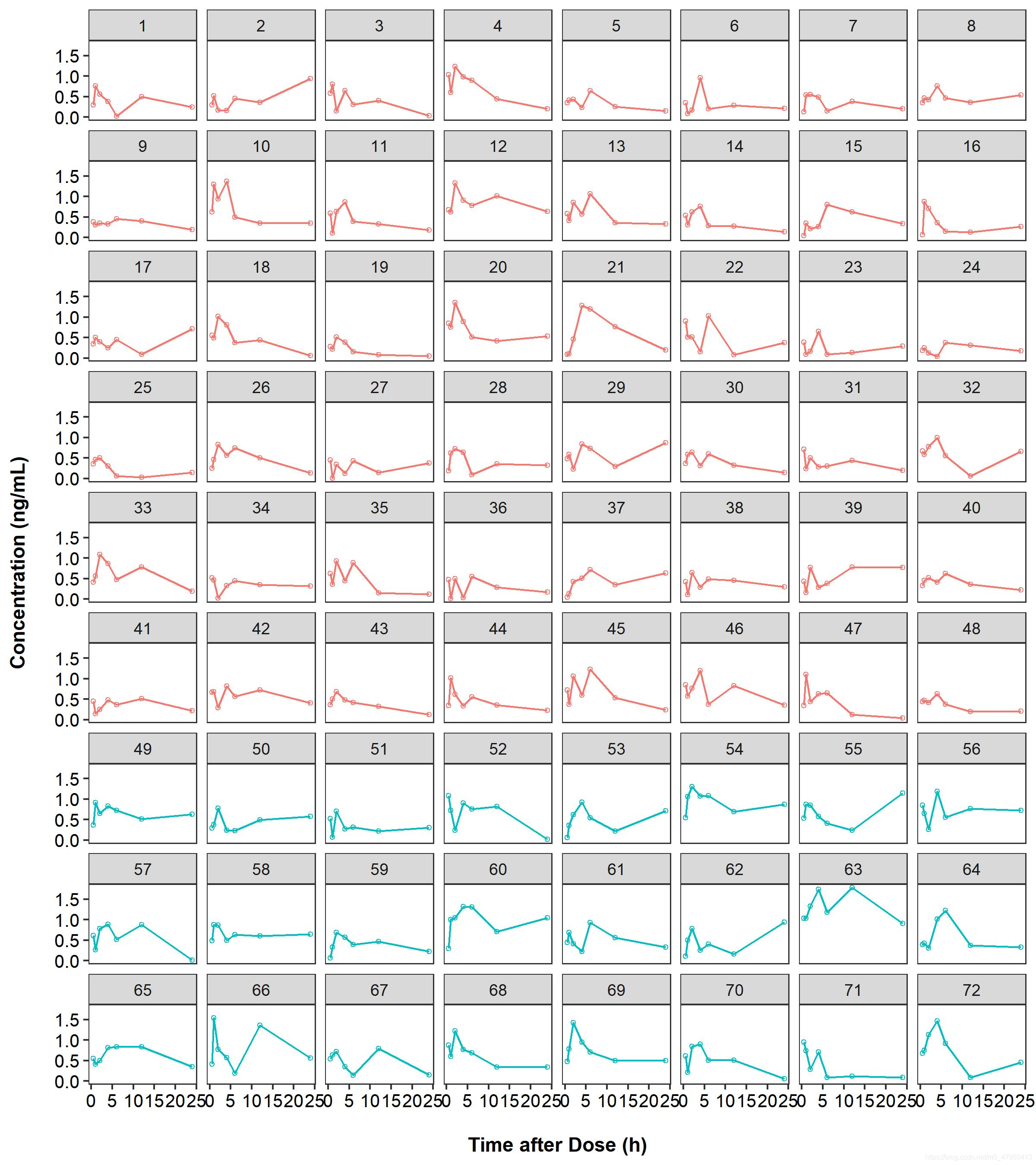
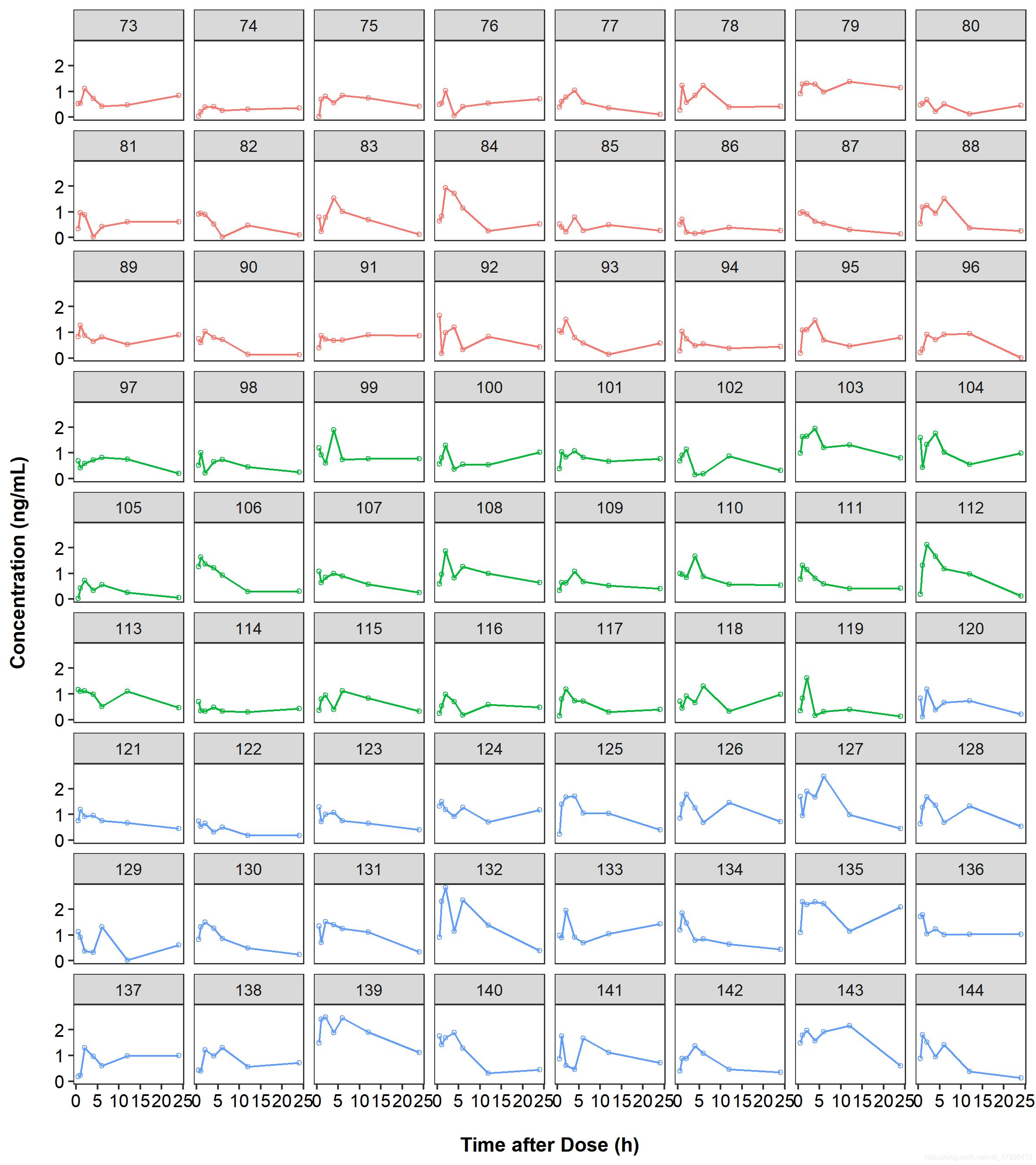
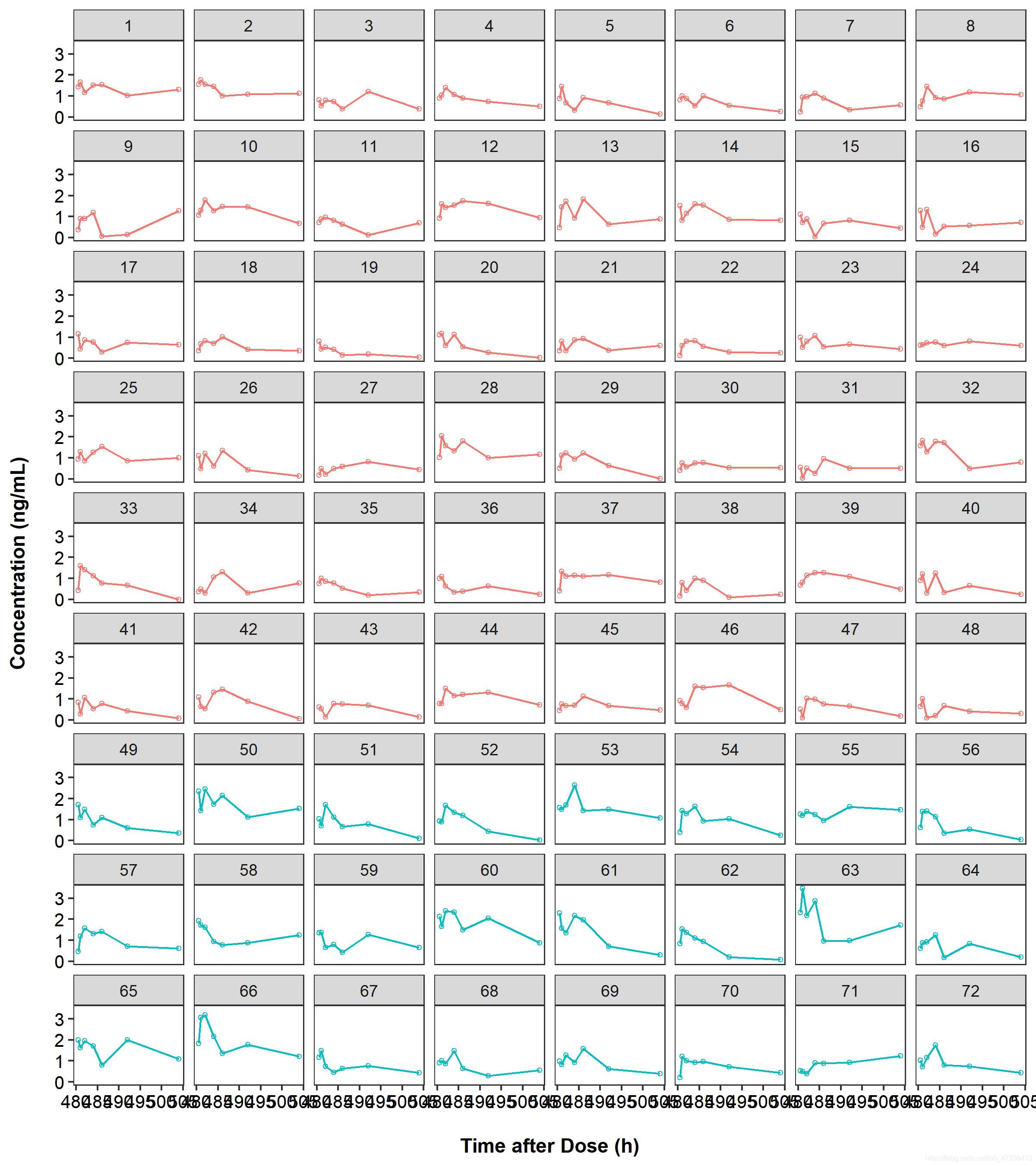
每个受试者血药浓度图
SAD受试者血药浓度
代码
#作SADCONC受试者分组图(1-72受试者)----
CONCIDprofile<-
  ggplot(data=filter(PKDATA,CID<73,TIME<=24),aes(x=TIME))+
  geom_line(aes(y=DV,group=DOSE_f,color=factor(DOSE_f)),linetype=1)+
  geom_point(aes(y=DV,group=DOSE_f,color=factor(DOSE_f)),shape=21,size=1)+
  # geom_line(data=filter(PKDATASAD,fast==0),aes(y=DV,group=DOSE_f,color=factor(DOSE_f)),linetype=2)+
  # geom_point(data=filter(PKDATASAD,fast==0),aes(y=DV,group=DOSE_f,color=factor(DOSE_f)),shape=21,size=1)+
  # xlim(0,24)+
  facet_wrap(~CID,ncol=8)+
  xlab("\nTime after Dose (h)")+ylab("Concentration (ng/mL)\n")+
  guides(color=FALSE)+
  theme_bw()+  #内置主题
  theme(axis.text=element_text(size=10,color='black'), #坐标轴字体设置
        axis.title = element_text(color='black',face = "bold"),#坐标轴标题设置
        panel.grid.major =element_blank(), panel.grid.minor = element_blank(),#网格线设置
        legend.position = "right") #图例设置
CONCIDprofile
ggsave("SADCONCIDprofile1.jpeg", CONCIDprofile, width = 8, height = 9)

#作SADCONC受试者分组图(72-144受试者)----
CONCIDprofile<-
  ggplot(data=filter(PKDATA,CID>72,TIME<=24),aes(x=TIME))+
  geom_line(aes(y=DV,group=DOSE_f,color=factor(DOSE_f)),linetype=1)+
  geom_point(aes(y=DV,group=DOSE_f,color=factor(DOSE_f)),shape=21,size=1)+
  # geom_line(data=filter(PKDATASAD,fast==0),aes(y=DV,group=DOSE_f,color=factor(DOSE_f)),linetype=2)+
  # geom_point(data=filter(PKDATASAD,fast==0),aes(y=DV,group=DOSE_f,color=factor(DOSE_f)),shape=21,size=1)+
  # xlim(0,24)+
  # scale_y_log10()+
  facet_wrap(~CID,ncol=8)+
  xlab("\nTime after Dose (h)")+ylab("Concentration (ng/mL)\n")+
  guides(color=FALSE)+
  theme_bw()+  #内置主题
  theme(axis.text=element_text(size=10,color='black'), #坐标轴字体设置
        axis.title = element_text(color='black',face = "bold"),#坐标轴标题设置
        panel.grid.major =element_blank(), panel.grid.minor = element_blank(),#网格线设置
        legend.position = "right") #图例设置
CONCIDprofile
ggsave("SADCONCIDprofile2.jpeg", CONCIDprofile, width = 8, height = 9)
作图结果
MAD受试者血药浓度
代码
#作MADCONC受试者分组图(1-72受试者)--------
CONCIDprofile<-
  ggplot(data=filter(PKDATA,CID<73,TIME>=480),aes(x=TIME))+
  geom_line(aes(y=DV,group=DOSE_f,color=factor(DOSE_f)),linetype=1)+
  geom_point(aes(y=DV,group=DOSE_f,color=factor(DOSE_f)),shape=21,size=1)+
  # geom_line(data=filter(PKDATASAD,fast==0),aes(y=DV,group=DOSE_f,color=factor(DOSE_f)),linetype=2)+
  # geom_point(data=filter(PKDATASAD,fast==0),aes(y=DV,group=DOSE_f,color=factor(DOSE_f)),shape=21,size=1)+
  # xlim(0,24)+
  facet_wrap(~CID,ncol=8)+
  xlab("\nTime after Dose (h)")+ylab("Concentration (ng/mL)\n")+
  guides(color=FALSE)+
  theme_bw()+  #内置主题
  theme(axis.text=element_text(size=10,color='black'), #坐标轴字体设置
        axis.title = element_text(color='black',face = "bold"),#坐标轴标题设置
        panel.grid.major =element_blank(), panel.grid.minor = element_blank(),#网格线设置
        legend.position = "right") #图例设置
CONCIDprofile
ggsave("MADCONCIDprofile1.jpeg", CONCIDprofile, width = 8, height = 9)

#作MADCONC受试者分组图(72-144受试者)----
CONCIDprofile<-
  ggplot(data=filter(PKDATA,CID>72,TIME>=480),aes(x=TIME))+
  geom_line(aes(y=DV,group=DOSE_f,color=factor(DOSE_f)),linetype=1)+
  geom_point(aes(y=DV,group=DOSE_f,color=factor(DOSE_f)),shape=21,size=1)+
  # geom_line(data=filter(PKDATASAD,fast==0),aes(y=DV,group=DOSE_f,color=factor(DOSE_f)),linetype=2)+
  # geom_point(data=filter(PKDATASAD,fast==0),aes(y=DV,group=DOSE_f,color=factor(DOSE_f)),shape=21,size=1)+
  # xlim(0,24)+
  # scale_y_log10()+
  facet_wrap(~CID,ncol=8)+
  xlab("\nTime after Dose (h)")+ylab("Concentration (ng/mL)\n")+
  guides(color=FALSE)+
  theme_bw()+  #内置主题
  theme(axis.text=element_text(size=10,color='black'), #坐标轴字体设置
        axis.title = element_text(color='black',face = "bold"),#坐标轴标题设置
        panel.grid.major =element_blank(), panel.grid.minor = element_blank(),#网格线设置
        legend.position = "right") #图例设置
CONCIDprofile
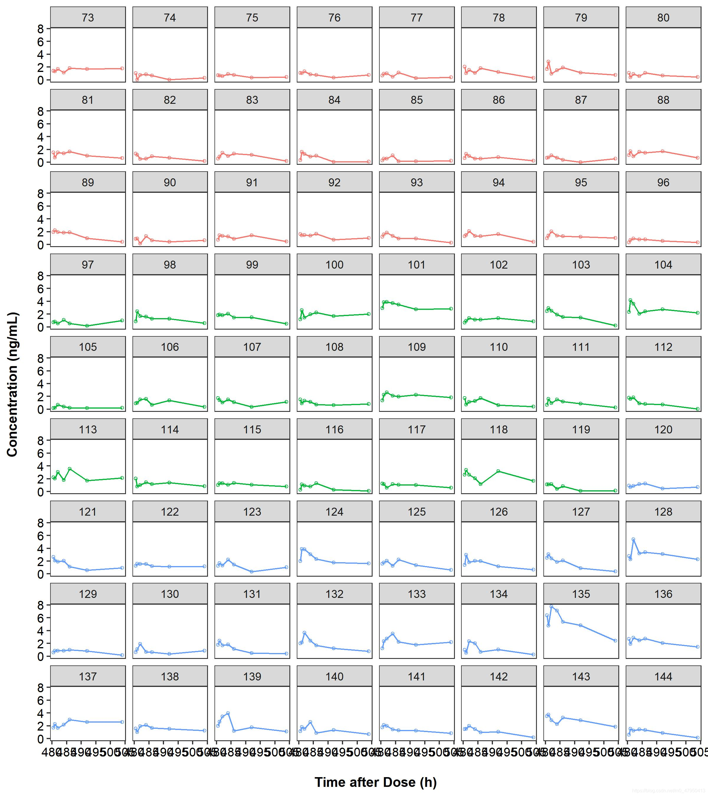
ggsave("MADCONCIDprofile2.jpeg", CONCIDprofile, width = 8, height = 9)
作图结果
PD数据探索
PD数据探索类似于PK数据探索,故只探索部分
平均药效指标图
代码
#作平均药效指标图(按照组别分组)----
PDPprofile<-
  ggplot()+
  geom_point(data=PDvsTIMEALL,aes(x=TIME,y=mean,color=factor(DOSE_f)))+
  geom_line(data=PDvsTIMEALL,aes(x=TIME,y=mean,color=factor(DOSE_f),group=DOSE_f),size=0.7)+
  labs(color="",shape="")+
  xlab("Time(day)")+ylab("Concentration (ng/mL)")+
  # xlim(0,216)+
  # ylim(0,20)+
  # scale_shape_manual(values = c(4:10))+
  scale_x_continuous(breaks=c(c(0,48,96,144,192,240,288,336,384,432,480,528)),
                     labels=c("0","2","4","6","8","10","12","14","16","18","20","22"))+

  facet_wrap(~DOSE_f,ncol=2)+
  theme_bw()+  #内置主题
  theme(axis.text=element_text(size=10,color='black'), #坐标轴字体设置
        axis.title = element_text(color='black',face = "bold"),#坐标轴标题设置
        panel.grid.major =element_blank(), panel.grid.minor = element_blank(),#网格线设置
        legend.position = "right") #图例设置
PDPprofile
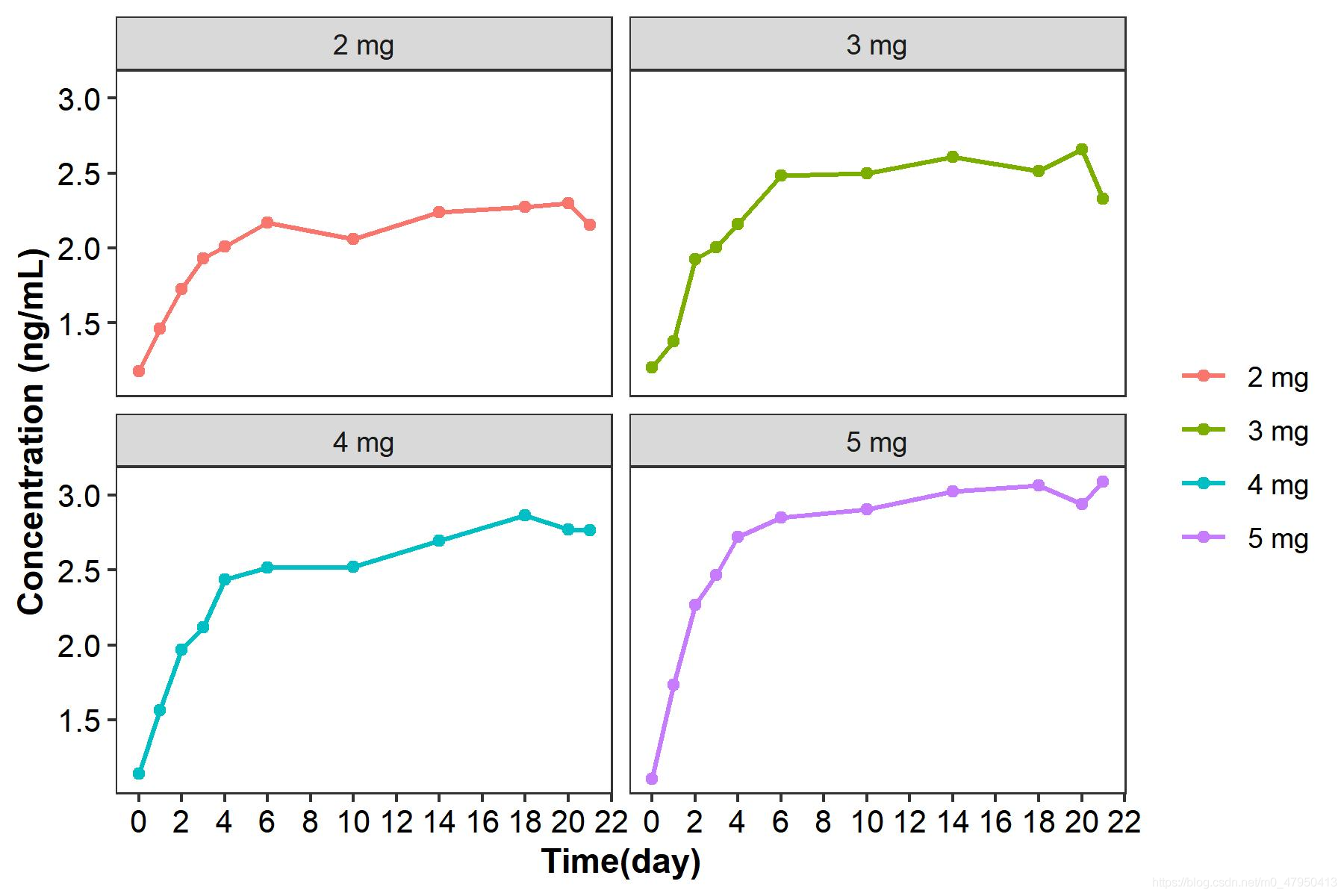
ggsave("ALLPDbygroupprofile.jpeg", PDPprofile, width = 6, height = 4)
作图结果
每个受试者药效指标图
代码
#作每个ID的药效指标图----
PDIDprofile<-
  ggplot(data=filter(PKDATA,CID<73,TIME>=480),aes(x=TIME))+
  geom_line(aes(y=DV,group=DOSE_f,color=factor(DOSE_f)),linetype=1)+
  geom_point(aes(y=DV,group=DOSE_f,color=factor(DOSE_f)),shape=21,size=1)+
  # geom_line(data=filter(PKDATASAD,fast==0),aes(y=DV,group=DOSE_f,color=factor(DOSE_f)),linetype=2)+
  # geom_point(data=filter(PKDATASAD,fast==0),aes(y=DV,group=DOSE_f,color=factor(DOSE_f)),shape=21,size=1)+
  # xlim(0,24)+
  facet_wrap(~CID,ncol=8)+
  xlab("\nTime after Dose (h)")+ylab("Concentration (ng/mL)\n")+
  guides(color=FALSE)+
  theme_bw()+  #内置主题
  theme(axis.text=element_text(size=10,color='black'), #坐标轴字体设置
        axis.title = element_text(color='black',face = "bold"),#坐标轴标题设置
        panel.grid.major =element_blank(), panel.grid.minor = element_blank(),#网格线设置
        legend.position = "right") #图例设置
PDIDprofile
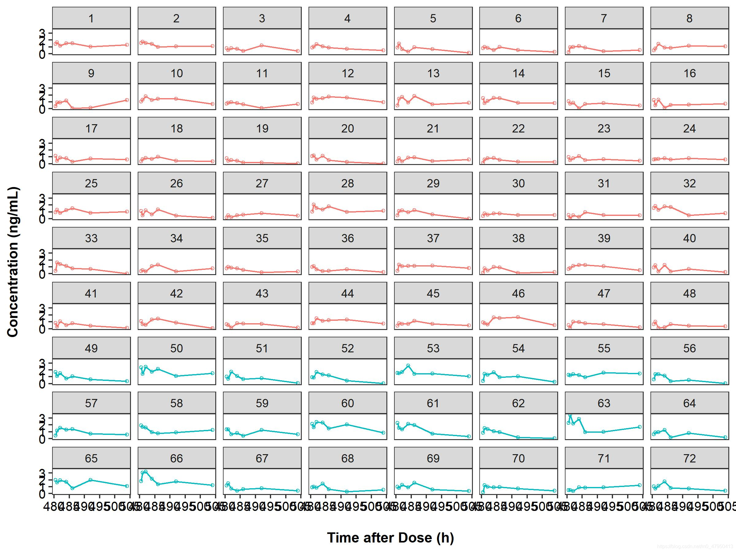
ggsave("SADPDIDprofile.jpeg", PDIDprofile, width = 8, height = 6)
作图结果


文章评论